
I flip through a lot of home design books in this job. Frankly, most run together. Betsy Wentz’s “Design Happy ─ Colorful Homes for the Modern Family” (available Feb. 21, Gibbs Smith Publishing) stands out as the exception.
All the interiors featured in the book’s photo-filled 224 pages jump out for their bright, unapologetic use of color.
“You can do that?” I thought.
Yes, you can. Well, at least Wentz can.
Wentz, 49, grew up working alongside her mother, an interior designer who ran a design shop out of the family home. Wentz pursued a career in psychology and after working as a counselor, came back and partnered with her mentor mom in 2001. When her mother retired 10 years later, Wentz rebranded and launched her own studio near Pittsburgh.
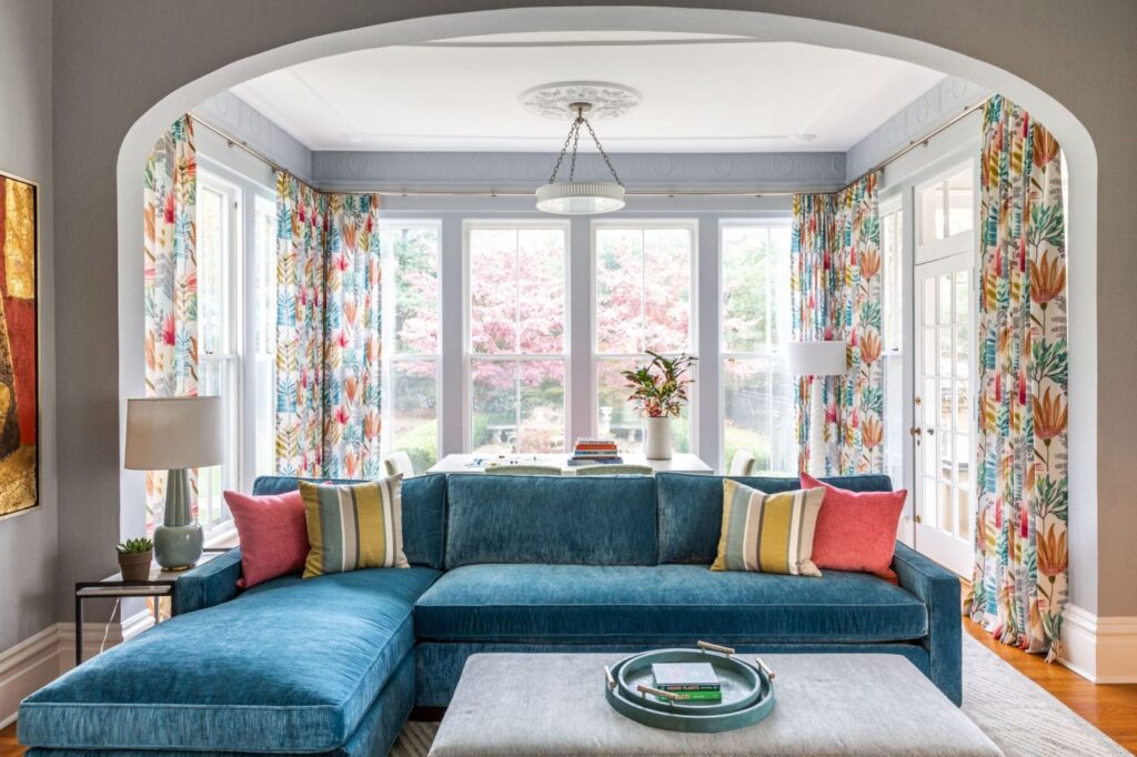
“Design Happy” by Betsy Wentz
A designer trained as a counselor. This makes perfect sense.
But back to the book. Of all the traits I admire in designers, creative courage tops my list, and Wentz has this gift in (paint) buckets.
I mean, this woman did not pause before covering an heirloom antique wooden grandfather clock ─ which let’s face it, few people really want in their homes anymore ─ with bright yellow citron lacquer paint, which made everyone in the family fall in love with it.
So, I called Wentz, who, proved just as colorful in conversation:
Q. You have a master’s degree in counseling psychology and were a behavioral therapist before starting a design firm. How do those two worlds relate?
A. At first, I didn’t think there was any correlation, but in fact, I use that degree every day. Designing someone’s home becomes very personal. From the moment you start working with someone, building that relationship is imperative, because that people piece is what makes a project click. I think every designer should have this degree.
Q. Did the title “Design Happy” spring from your therapy background?
A. Yes, in a sense. I like to think the common thread when you look through these interiors is they are happy environments. We wanted a title that would get across that this book is about having fun with color, design and pattern. Your surroundings affect your mood and your quality of life. I tell clients let’s start with colors you’re comfortable with, then let’s add one that you are a little uncomfortable with.
Q. Of all the colors in your interiors, intense blue, especially deep turquoise, seems to be the common denominator. Why?
A. Let me start by saying there is not a color I don’t like. But blue! I’ve never met anyone who doesn’t like blue. I try to find a color combination that is unique to each client and in their bandwidth. If a client really wants neutral, I go high contrast. I put white with aubergine. However, a medium bright palette is my favorite.
Q. Because of their colorful interiors, the homes in your book look as if they are all in bright sunny places. But many are near you in Pennsylvania, and others are in Ohio and Maine. Talk to me about color and geography.
A. That a home in an area not saturated in natural color can’t be colorful is a mistaken stereotype. I live in Pittsburgh. Today it’s very gray and drab out. The trees have no leaves, but my home is full of color. Just because it’s Maine, doesn’t mean you have to decorate in dark green. I see a place for color everywhere. Don’t ignore your setting, but do add splashes of color.
Q. Tell me about your signature touch.
A. For me, it’s a twist. It can be an unexpected pattern on pattern, or having the nerve to put two patterns or colors together that most people wouldn’t. I use a lot of colorful vintage rugs. You have to be careful not to cross the line of “too much,” but the longer I do this, the more permission I give myself.
Q. What makes you cringe when you walk into someone’s home?
Related Articles
Grow your own floral bouquets and more to do in the garden
How to combat erosion in your garden with plants, terracing
What to know about herbicides before using in your garden
Finding inspiration for pollinator-friendly home gardens at The Living Desert
The joys of a semi-dwarf navel orange tree and other hardy citrus with winter fruit
A. Circular rugs — I don’t know why. Vertical blinds, in general. Poor lighting, particularly a fixture that is too small for the space. You can almost never go wrong with a big light. Ceiling fans with built-in lights are never okay. We call them fandeliers. Just get a plain fan and add recessed lights.
Q. If you had one word of design advice for those of us trying to liven up our homes, what would it be?
A. Go for what you like. Most people know what they like, but are afraid to take a chance on a great color or pattern because, they say, “I’m afraid I’m going to get tired of it.” That’s no fun at all. If you love something own it and do it. That’s also a metaphor for life. Don’t be afraid.
Marni Jameson is the author of six home and lifestyle books. Reach her at www.marnijameson.com.
Recent Comments